

Can you name a brand by looking at their logo? Did Starbucks, Google or Apple come to mind? A logo is meant to reflect the values inherent in the brand, either representationally or abstractly. It is not your brand, but it is the visible embodiment of your brand attributes, and a good logo induces an emotive and empathetic connection with its audience. Does your logo accurately capture your brand values and inspire an emotion?
So what makes a good logo great?
Two Types of Logos.
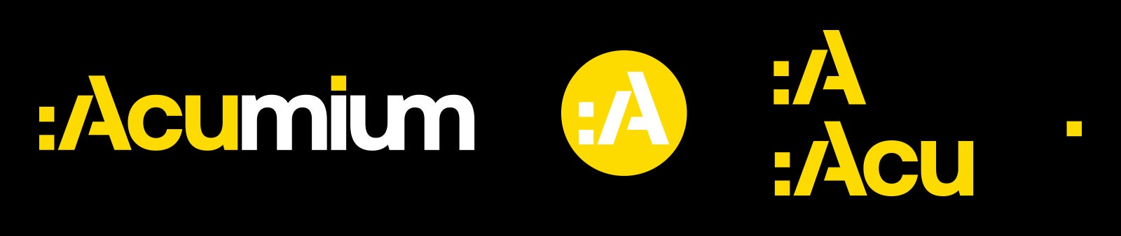
For simplicity sake, logos can be broken down into two groups. The first, wordmark or logotype, is a typographic representation of the brand name. The second, symbol or mark, represents the brand name abstractly or literally. In either case, they need to be the visual language for the brand. A wordmark can be used on its own, think FedEx, Crate & Barrel, Dell and Google. Whereas, a symbol usually has some typography to reinforce it, but some can stand entirely on their own like the Apple, Nike’s swoosh and McDonald’s Golden Arches. Wordmarks and symbols can also be integrated together and is something we do with the Acumium logo on our website. You’ll see the full wordmark logo in some places and then the A symbol in the upper left corner to lead you back to our homepage.
The Rise of the Logo System.
"Logo systems" have become common within marketing departments, where brands will use different elements, color schemes and configurations based on the original logo across marketing collateral. These systems supplement and reinforce the visual vocabulary of the brand and are incredibly useful. If we look at the Acumium logo, for example, it is a wordmark, but several pieces can be pulled out for other exciting usages, the "A" itself can stand as a symbol, the colon and forward slash can be inventively used in different contexts as can the "Acu." These playful interactions reinforce the experimental and creative nature of the brand. Google also does this with their daily doodle, where the brand will use drawings or animations based on holidays to pull in their creativity and playfulness.
What Makes an Excellent Logo?
Understanding the Company or Product
Regardless of type, the goal of a logo is to visually represent key brand characteristics and resonate those values with an audience. In order to achieve this successfully, many factors go into this process. Some brand design projects start from an almost blank slate: new products, start-ups, mergers are good examples of these types of projects. Research into the brand background and target audience is required since there is nothing inherited from an existing identity.
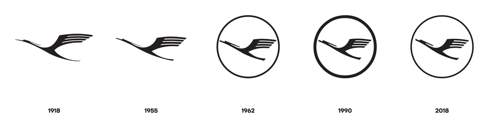
Other projects come with deep-rooted history, and this heritage needs to be carefully considered. Is there value in the current logo, or does it require complete reimagination? One recent logo redesign has stirred quite a bit of controversy: long time German airline Lufthansa. Their main focus was to have the logo system work across multiple touchpoints, but Lufthansa’s logo was a classic. Famed designer Otl Aicher updated the now classic moderne flying crane marque in 1962 in a time when digital wasn’t a consideration. The new update kept most of the spirit or Aicher’s original design, but cleaned it for digital and it works!
A Design that Works
First and foremost, a logo must work in black and white. The symbol or font needs to stand on its own strengths without the addition of color to enhance it. Color elevates the logo and will inspire emotion. The careful choice of color needs to reflect key brand components to resonate with the viewer. Yellow, for example, is associated with warmth and happiness, while blue represents stability and trust. And can we even imagine a world without the Coca-Cola red, which reflects dominance and vitality?
A Logo with a Mission
It should be the primary goal of a designer to create a logo with meaning and at its best it should be classic, modern and timeless all at once. This process requires a great deal of thought, research and experimentation and the results may not always be apparent at first. The Nike swoosh is a classic example. The logo was initially commissioned to an Oregon art student, Carolyn Davidson, who crafted the checkmark type logo because of the representation of movement and speed and also its resemblance to a wing that paid homage to the name Nike, the Greek goddess of victory. Initially, the logo did not go over well with stakeholders, but with time it became one of the most individual and identifiable images in the history of advertising. As with the Nike logo it usually takes time for a classic to emerge; it’s a marathon not a sprint.
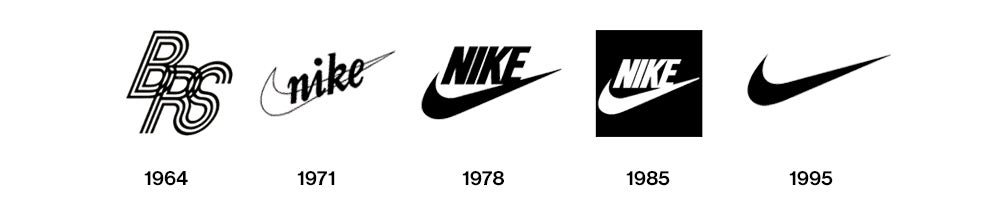
Even classic, iconic logos require updates, tweaks and modernization. The Nike font, for example, has been updated but the swoosh remains. Federal Express to FedEx is an excellent example of a successful brand pivoting with a new name. Customers were already using the abbreviated name so the logo was modernized to match customer preference. Recently, Mastercard went through some extensive brand changes that were just as advanced, but somewhat more subtle. The interlocking circles of their logo were replaced overlapping slightly different colored circles, and like Nike and Starbucks, they removed their name, aligning themselves with this elite cadre of brands.
The Final Takeaway.
A lot goes into the creation of a great logo, and it can take dozens and dozens of iterations to get it right, but when you carefully consider heritage, audience, graphical impact, emotion, and color and apply them to the logo, you will have a mark that accurately represents and elevates the brand.
Our creative team at Acumium works on dozens of client logos a year, tweaking each one to fit the unique personality of each of our partners. Learn more by speaking with a member of our team.