

Your website should provide an engaging and enjoyable experience for your users that reinforces your brand and generates leads. Determining what makes a website easy to use can be difficult, but usability is a critical component of a successful digital presence. Nielsen Norman Group characterizes usability well, calling out five key components that help assess how easy a digital interface is to use. These 5 principles are essential to taking your site from confusing to frictionless. Let’s review these components and some of the companies that are leveraging them to their fullest.
1. Learnability
When a visitor lands on your website or opens your application, how well does the design reveal the first, most important task they want to complete (or that you want them to do)? A usable interface is easy to learn. It doesn’t require training text like “Click in the upper right to get started!” or directions on what they should do. From any page, the design clearly telegraphs to the visitor what they can accomplish and where to start.
Implementing learnability on your site is simple, keep your calls to action easy to identify. Reducing the clutter on your site and using plain language the customer understands will help them reach their ultimate goal, whether that’s shopping, booking or reading more.
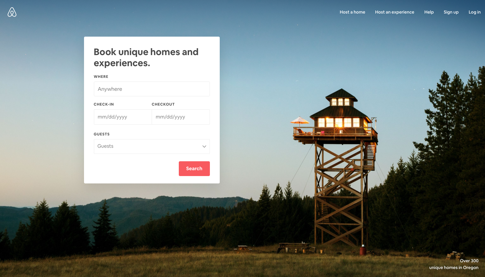
Take for example, AirBnB. With simple language and a decluttered design, booking is simple and quick. Their homepage gets straight to the point: book a unique home or experience and complete the simple form.
2. Efficiency
Now that a visitor understands what they can do on your site, how quickly and easily can they complete a task? A usable interface keeps individual workflows fast, frictionless, and focused. You may have heard the fewer clicks it takes to complete a conversion the better, but that isn’t as important as enabling workflow completion with speed and confidence.
To provide an efficient experience for your visitors, bring your calls to action to the forefront and have consistency with where they’re placed on-screen. Avoid adding too many options that might distract or confuse them from their primary goal.
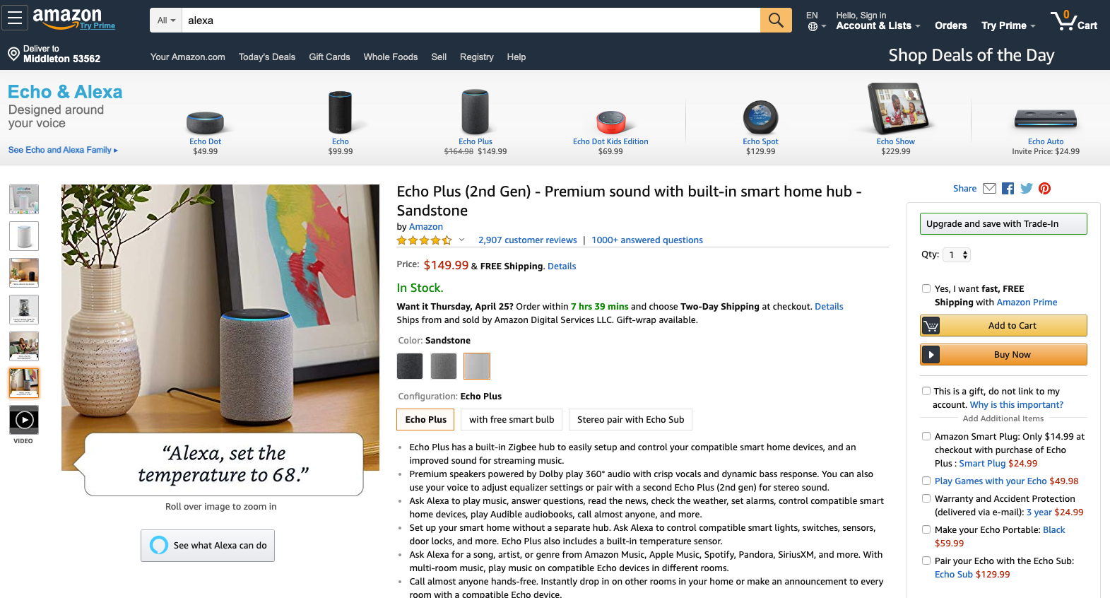
Amazon doesn’t have the most beautiful interface, but it’s very efficient. Tools like “Buy Now” and the multiple ways they facilitate quick checkout through saved info and preferences offer users opportunities to make quick and easy purchases.
3. Memorability
Imagine a visitor hasn’t frequented your site recently, and then they return. How quickly can they re-establish comfort and proficiency with the interface? A usable interface, even if it’s had some design tweaks, should be comfortable and familiar.
To maximize memorability, use established patterns and paradigms so your visitors can easily navigate your site. Don’t shy away from redesigns, but don’t make such drastic changes that your users have to re-learn how to do the things they came to your site to do.
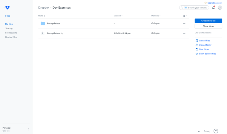
Dropbox offers a memorable experience to users because it uses a well-known paradigm, that of a folder/file structure. Even if you don’t use Dropbox every day, it’s likely you’ll be able to effectively use it when you return, because navigating a folder structure and dragging and dropping files is natural and familiar.
4. Errors
Errors should be few and far between on a usable interface. Easy to use sites prevent user error as much as possible. When errors occur, they are recoverable and it’s clear to the visitor what they need to do to move ahead.
For a better experience, work on minimizing the likelihood of errors. In instances where errors may occur, make your error messages clear and written in plain language.
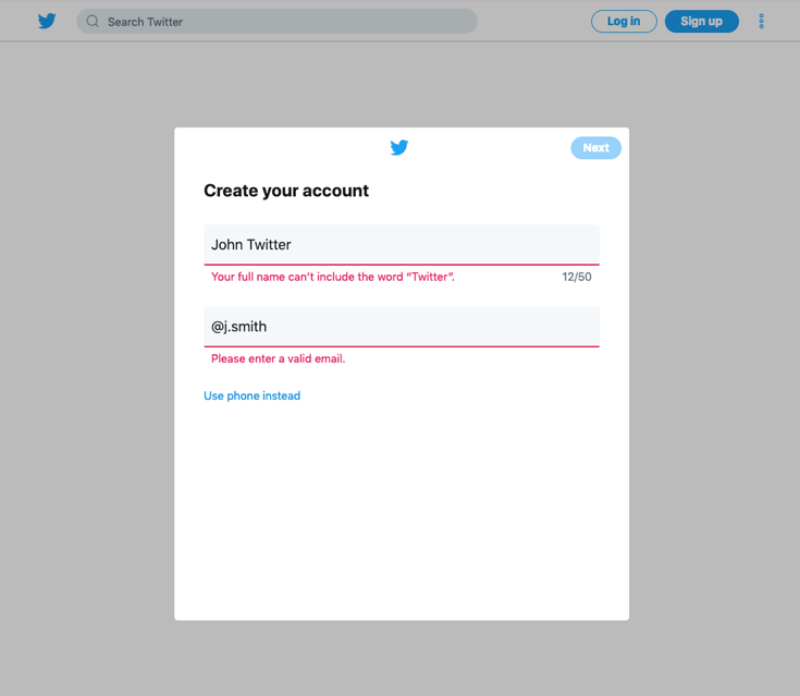
Twitter provides a very clean and streamlined sign-up experience that includes minimal fields, which in itself can reduce errors, and when error messages occur they’re easy to fix because of the language and visibility.
5. Satisfaction
A usable interface leaves a positive impression, visitors should be satisfied once they’ve left your site. Many of the most usable websites are so frictionless visitors won’t even realize how easy their visit was.
To keep your visitors happy, optimize their experience by understanding what they want to achieve. Once your fundamental elements are in place, consider adding in delightful elements for an elevated experience, just ensure they don’t interfere with achieving their goal.
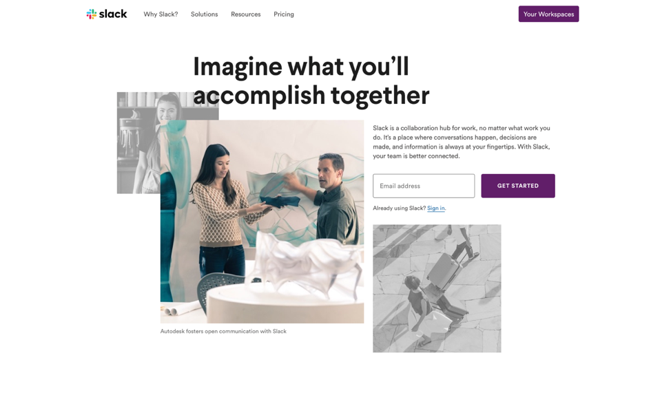
Slack is a great example of a highly satisfying experience. Using Slack isn’t just intuitive, it’s fun. The Slack team inserts little points of delight into the experience that don’t have any sort of detrimental effect on people accomplishing goals.
To ensure you're providing your visitors with a usable site, keep these five principles in mind as you design a digital product.
- Learnability
- Efficiency
- Memorability
- Errors
- Satisfaction
Make it easy for people to use your website. Let's jump in.