

Since 2001, Acumium has been deploying custom development for some of Wisconsin's most well-known brands, and beyond. But in 2018, when Acumium merged with creative agency Lackner-Buckingham, it was time to take a look internally and review the Acumium identity, including its logo design. After hours of internal and external research, the team identified the key brand attributes that set Acumium apart from other digital agencies. These attributes became the foundation for the new visual identity and tone of voice moving forward. Here’s how the new Acumium look came to be.
Incorporating decades of history into a re-design.
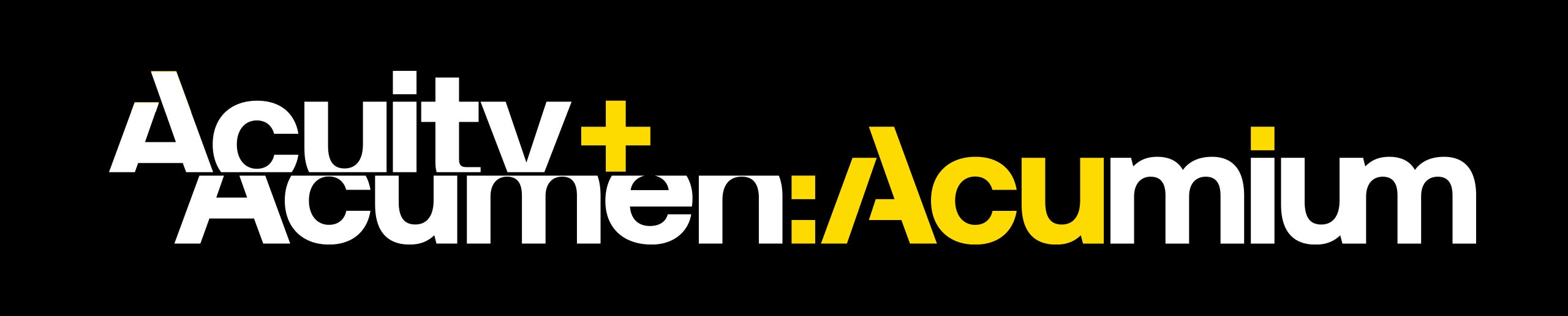
With any rebrand, the first step is determining if there is any value in the existing identity. Is there history, meaning, or aesthetics that merit consideration? With the existing Acumium logo, it had history, but it had some redundancies when it came to its design. It consisted of a thick swoosh "A" symbol and the "ACUMIUM" wordmark. The combination read A ACUMIUM which seemed unnecessary. When we thought about the re-designed logo, it made the most sense to move the A symbol into the wordmark. This was the starting point for the rest of the design.
The previous design:
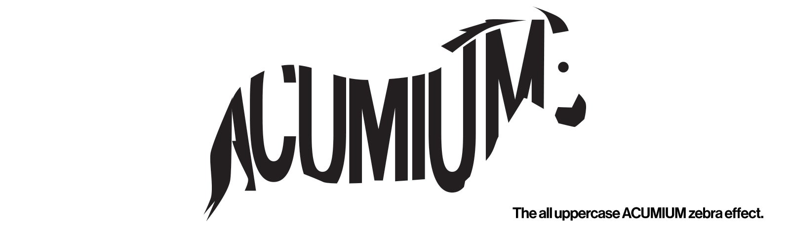
The Acumium name itself has a pretty interesting meaning, it’s the melding of two words: acuity and acumen. Because of the strong definition and decades of history, we wanted to keep the name the same, but we realized there were some issues with the form of the current logo. When you use ACUMIUM in all caps, as the original logo did, you get a zebra effect of vertical stripes that made it difficult for people to read and pronounce. Instead, "cumium" should be in lower case for better readability for clients, industry partners, employees, and family and friends.
The ACUMIUM zebra effect…literally.
Now that we knew what needed updating, we played around with many iterations of the two components of the new logo; the symbol using the bespoke "A" and the “cumium” text that followed. The new design also needed to imply collaboration and transformation. With the addition of the Lackner-Buckingham team, that meant Acumium now offered creative design services that were not part of its offerings for clients previously. To highlight those capabilities, we integrated the Lackner-Buckingham symbol, a square pixel and a "/." These elements are ubiquitous in programming and development. The punctuation, in itself, wasn't enough, so a ":" was added in front of the "/." The colon represents a bridge as it is used to link separate thoughts. The square dots of the colon also represent pixels. As a digital development agency, the resulting ":/" was harmonious. Acuity+Acumen:/Acumium. Lackner Buckingham:/Acumium. In the end, it was this version chosen.
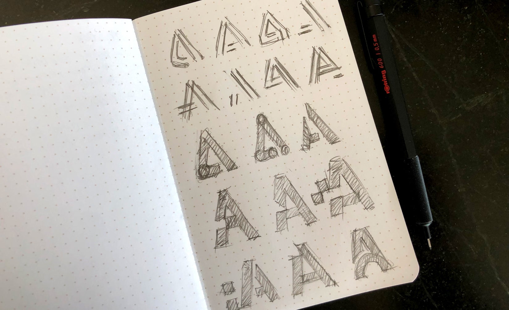
Of the 70+ iterations, we narrowed it down to six strong candidates that were tested across internal and external eyes for feedback. Each design had a different meaning, but they all reflected the vital brand attributes that were determined from our research. To ensure design best practices and get honest feedback, we leveraged colleagues from an external design community to review the logo and test its usability and application and provide their feedback as to whether our designs were hitting the mark. From their recommendations, we were able to further tweak and adjust smaller elements of the logo to get the final design.
Over 70 iterations to find the right one.
Choosing the right font for the right effect.
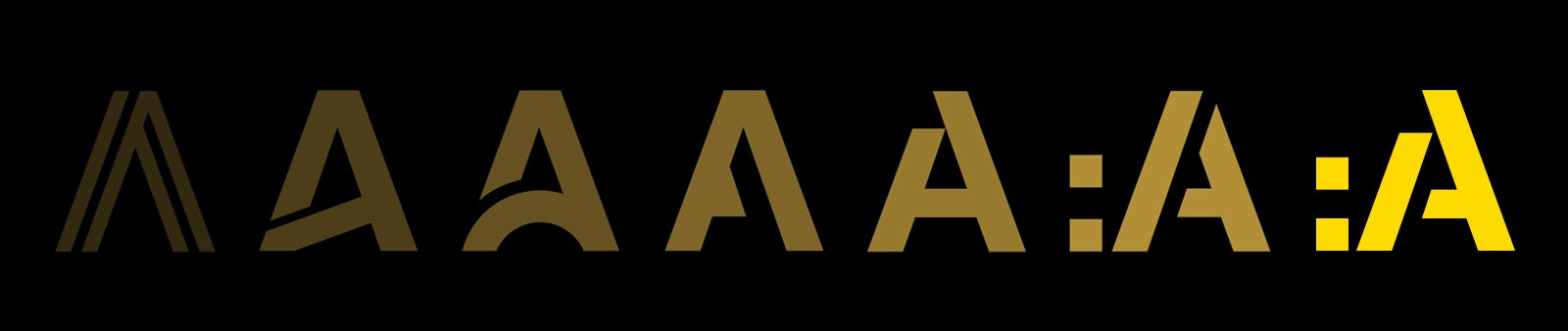
Fonts can have a big impact on how your logo will look to customers. Serif fonts can add an air of sophistication and rationale. Sans-Serif are classic, informal and reflect innovation. Beyond Serif vs. Sans-Serif, you have style variations within each. Sans-Serif, for example, have grotesques, neo-grotesques, geometric and humanist flavors. For the new Acumium symbol, we chose a neo-grotesque form with modernist roots, but details referencing mechanical early grotesques. It's a neo-grotesque with a geometric skeleton; very modern and versatile. Structurally, this created a fantastic balance for both display and text use.
The resulting shape also suggested several abstract meanings. The negative space in the A looked like an Exacto blade, which was a standard tool in pre-desktop revolution days of graphic design — a nod to our analog roots. It also represents precision and the precise nature of our work as a firm. Removing the notch in the "A" reveals the "/" and also mimics the "top-notch" elevation of the brand. The symbol was then integrated symbiotically with the chosen font to blend at the precise height, lining up perfectly.
Inspiration can come from unexpected sources and an experimental typographic rendering by Founder and CEO Dan Costello's son sparked the form the letters would take. The drawing showed the yin and yang of running the letters together, creating unusual negative shapes that oddly remained quite legible. The resulting design included the first three letters employing a contrasting color to help with the pronunciation of Acu-mi-um. Running the last two letters "um" together promotes fluidity and further lessons the zebra effect.
Updating brand colors for a vibrant look.
Color implies emotion and choosing the right color for your brand should be taken seriously. For Acumium, we wanted to update the yellow from the original logo but replace the blue with black. Yellow is an uplifting color and when played off black, it creates a powerful visual statement. Road signs, construction zones, and school buses, for example, all use these colors and so they are engrained in our very nature to draw attention. When you see the new Acumium logo it takes a confident stand compared to the old logo because of the slight adjustments to the yellow overlaid on black.
The final design.
The final wordmark is classic, simple, meaningful, creative, yet experimental. The end product invigorates and elevates the brand. It fits perfectly with the key brand attributes, forming the foundation of a robust design system that stretches across multiple touchpoints, including brand imagery, creative elements, and marketing collateral.
We take logo design seriously, tweaking each one to fit the unique personality of each of our clients. Learn more by speaking with a member of our team.
Paul is a member of AIGA Chicago, The Type Directors Club NYC and the Typographic Circle London.